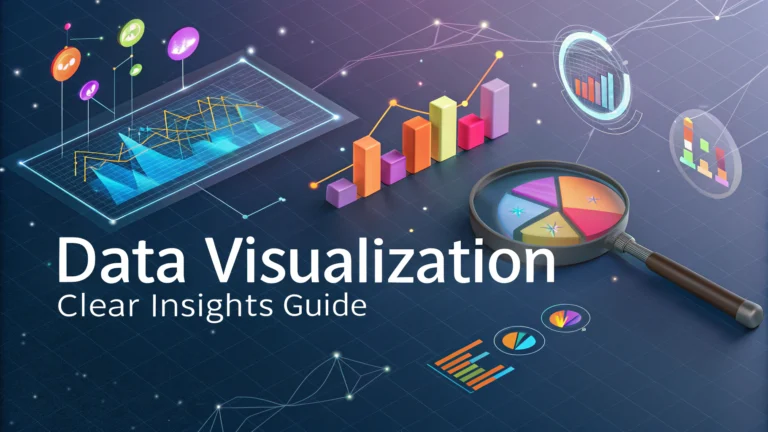
Data visualization transforms complex hotel performance metrics into clear, actionable insights that drive better marketing decisions.
Hotel marketers who master data visualization gain a significant advantage in identifying trends, communicating value propositions, and optimizing their marketing strategies.
This guide shows practical ways to create impactful visualizations that help improve occupancy rates, revenue, and guest satisfaction.
Essential Hotel Metrics to Visualize
- Average Daily Rate (ADR)
- Revenue Per Available Room (RevPAR)
- Occupancy Rates
- Booking Lead Times
- Channel Performance
- Guest Demographics
Choosing the Right Chart Types
| Data Type | Recommended Visualization |
|---|---|
| Occupancy Trends | Line Charts |
| Revenue Distribution | Pie Charts |
| Booking Patterns | Bar Graphs |
| Geographic Data | Heat Maps |
Tools for Hotel Data Visualization
- Tableau: Professional-grade visualization software perfect for large hotel chains
- Power BI: Microsoft’s solution with excellent integration capabilities
- Google Data Studio: Free tool ideal for smaller properties
- Looker: Cloud-based platform with real-time analytics
Best Practices for Clear Visualizations
Use consistent color schemes that align with your hotel brand.
Label all axes and data points clearly to prevent misinterpretation.
Keep designs simple and avoid unnecessary decorative elements.
Include interactive elements for deeper data exploration.
Creating Effective Dashboard Layouts
- Place high-priority metrics at the top left
- Group related information together
- Use consistent spacing between elements
- Include filters for customized views
- Optimize for mobile viewing
Presenting Data to Stakeholders
Tell a clear story with your data by highlighting key insights first.
Use comparison metrics to provide context and show progress.
Create separate views for different audience needs (management, marketing team, investors).
Taking Action on Visual Insights
- Set up automated alerts for metric thresholds
- Schedule regular data review sessions
- Document successful optimization strategies
- Train team members on data interpretation
Next Steps for Implementation
Start with a simple dashboard focusing on your top 3-5 KPIs.
Test your visualizations with actual users to ensure clarity and usefulness.
Regularly update and refine your visualizations based on feedback and changing business needs.
For professional help with hotel data visualization, contact analytics consultants like HotelIQ or Revinate.
Advanced Visualization Techniques
Interactive Elements
- Drill-down capabilities for detailed analysis
- Hover effects showing additional data points
- Dynamic date range selectors
- Custom filtering options
Automated Reporting
Set up scheduled reports to distribute visualizations automatically to key stakeholders.
Configure alerts for significant metric changes or threshold breaches.
Data Integration Strategies
- Connect multiple data sources into unified dashboards
- Implement real-time data syncing
- Establish data validation protocols
- Create backup systems for data security
Performance Optimization
Speed Improvements
- Cache frequently accessed data
- Optimize query performance
- Implement data aggregation
- Use efficient loading techniques
Training and Adoption
Develop comprehensive training materials for staff members.
Create user guides for different visualization tools.
Schedule regular workshops for skill enhancement.
Elevating Your Hotel’s Data Strategy
Implement these visualization techniques gradually to build a robust data-driven culture.
Focus on creating actionable insights that drive measurable improvements in hotel performance.
Regularly evaluate and update your visualization strategy to stay competitive in the evolving hospitality landscape.
Remember that effective data visualization is an ongoing journey of refinement and optimization to support better decision-making across your organization.
FAQs
- What are the most effective data visualization types for hotel occupancy trends?
Line charts and heat maps are most effective for occupancy trends, with line charts showing seasonal patterns and heat maps displaying occupancy rates across different room types and time periods. - How can hotels use data visualization to optimize room pricing?
Through dynamic pricing dashboards that display competitive rates, historical pricing data, and demand patterns to make informed pricing decisions and maximize revenue per available room (RevPAR). - What guest satisfaction metrics should be visualized in hotel analytics?
Key metrics include NPS scores, review ratings, sentiment analysis from social media, department-specific satisfaction scores, and trend analysis of guest feedback over time. - How can data visualization help in identifying target markets for hotels?
Through geographic heat maps showing guest origin, bubble charts displaying guest demographics, and scatter plots showing correlations between guest profiles and booking patterns. - What revenue metrics should be included in hotel performance dashboards?
RevPAR, ADR (Average Daily Rate), GOPPAR (Gross Operating Profit Per Available Room), and channel-specific revenue breakdowns should be visualized in performance dashboards. - How can data visualization improve hotel marketing campaign effectiveness?
By creating visual funnel analyses of campaign performance, conversion rate visualizations, and ROI charts across different marketing channels and campaigns. - What are the best ways to visualize competitor benchmarking data?
Radar charts for comparing multiple metrics simultaneously, bar charts for rate comparisons, and line charts for tracking market share and performance indices over time. - How should hotels visualize booking pattern data?
Through booking pace charts, lead time analyses, channel distribution pie charts, and calendar heat maps showing peak booking periods and cancellation patterns. - What visualization tools are most suitable for hotel analytics?
Industry-standard tools include Tableau, Power BI, and specialized hotel analytics platforms like STR, which offer customized visualization capabilities for hospitality data. - How can hotels effectively visualize forecasting data?
Through predictive trend lines, confidence interval bands, and scenario analysis charts that show multiple potential outcomes based on different variables.